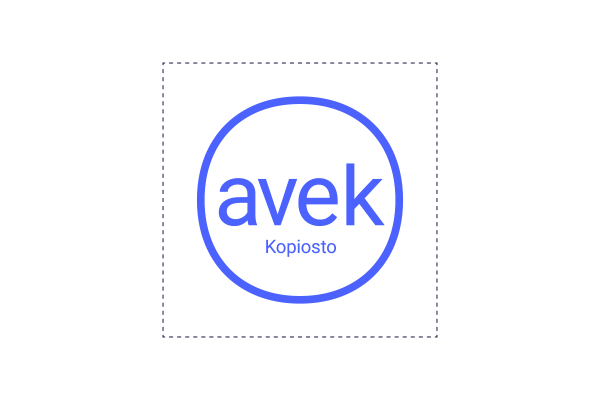
1. AVEK’S LOGO
AVEK is part of Kopiosto. Thus AVEK’s logo uses the same elements as Kopiosto’s brand style. In the primary version of the logo Kopiosto is written below AVEK. A secondary logo, lacking the word “Kopiosto”, can be used in exceptional situations (in small size, when AVEK’s connection to Kopiosto is clear).
The logo is surrounded by an area where no other elements may be added. This safe zone is a part of the original logo.
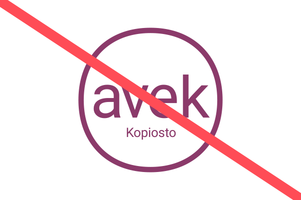
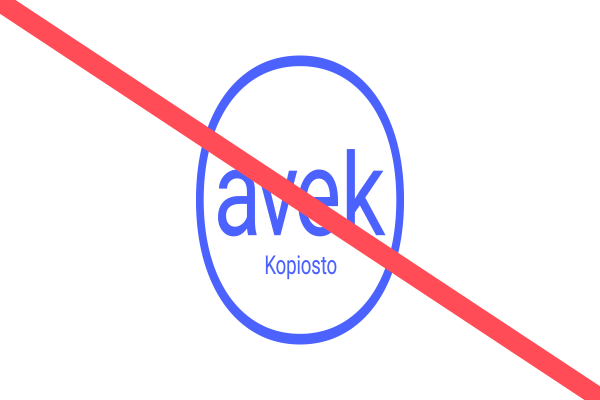
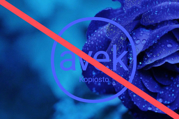
Please don’t use any logos other than these official logos or change the original logos (for example their colour or dimensions). The logo may not be used on a busy background or on a background where the logo doesn’t stand out.
Please don’t add any text or element after or near the logo, as this might cause the original logo to become indistinct.
Variations of the logo are not allowed.
You can download the entire logo package below:
LOGOS IN RGB FORMAT FOR ONLINE USE
AVEK_secondarylogo_RGB (pdf/png)
Pictures in CMYK format and other colour options can be found from the logo package at the beginning of this page. For additional information and assistance, please contact Kopiosto’s communications: viestinta (at) kopiosto.fi.
2. FONTS
We use the free Google fonts Roboto and Roboto Condensed in all our communications.
Several font styles may be used of Roboto, but they should be used with consideration so that the appearance isn’t confusing.
We use Roboto Condensed Bold in headings.
Below are the most used font combinations.


3. COLOURS
AVEK’s colours are consistent with Kopiosto’s cheerful and recognizable colour palette. The main colour of AVEK is blue and it’s used the most.
Other brand colours are used to fulfill the colour palette, but not in a way that causes the look to become confusing.
The additional colours (orange, green and purple) are used only in infographics, and only if the five primary colours are insufficient.
For text we use the dark blue colour on white, light yellow or light blue – or if necessary other dark brand colours. On blue, dark blue or red we use white text or if necessary other light brand colours. We take into account accessibility when choosing text colours.
Avoid using red-yellow combination, it’s a sign of warning symbol.
MAIN COLOUR
 |
| AVEK’s Blue CMYK 80, 60, 0, 0 RGB 75, 98, 254 (#4b62fe) PMS 2728 C |
OTHER BRAND COLOURS
 |
 |
 |
 |
| Kopiosto’s Red CMYK 0, 80, 60, 0 RGB 255, 76, 86 (#ff4c56) PMS 1787 C |
Dark Blue CMYK 80, 80, 0, 70 RGB 35, 38, 74 #23264a PMS 540 C |
Light Yellow CMYK 2, 0, 60, 0 RGB 248, 240, 134 #f8f086 PMS 393 C |
Light Blue CMYK 16, 0, 2, 0 RGB 220, 240, 250 #dcf0fa PMS 290 C |
ADDITIONAL COLOURS (used only in infographics)
 |
 |
 |
| Orange CMYK 45, 0, 70, 0 RGB 255, 162, 86 (##ffa256) |
Green CMYK 70, 0, 70, 0 RGB 65, 179, 113 #41b371 |
Purple CMYK 70, 8o, 0, 0 RGB 166, 66, 150 #a64296 |
MORE ADDITIONAL COLOURS (used only in infographics)
 |
 |
 |
 |
 |
| Light orange CMYK 0, 27, 50, 0 RGB 255, 185, 128 (#ffb980) |
Light purple CMYK 0, 29, 5, 26 RGB 188, 113, 176 (#bc71b0) |
Light red CMYK 0, 53, 50, 0 RGB 255, 120, 128 (#ff7880) |
Light blue CMYK 53, 47,0,0 RGB 119, 136, 255 (#7788ff) |
Grey CMYK 11, 10, 0, 50 RGB 101, 103, 128 (#656780) |
4. INFOGRAPHICS
All elements of our infographics, such as graphs and pictogrammes, follow the shape of our logo and use brand colours.
 |
 |
 |
 |
| Quotation marks | Trophy | Pictogrammes are drawn with an evenly thick line | Graphs are simple and use brand colours |
Please note:
- Graphs should have a white line separating different areas if necessary.
- If text is placed on top of graphs, it must be white.
- All text outside of graphs must be dark blue violet.
- All text related to graphs must be in Roboto Condensed.
- For infographics, you may use a colour scale of either reddish to dark or dark to reddish. In other words, infographics may not use a ‘circus colour’ scheme.
5. PHOTOS
Our photos are colour pictures of authors and works. Also high quality editorial pictures (of events etc.) may be used.

HIGH QUALITY PICTURES OF AUTHORS
Mika Taanila, Photo: Riitta Supperi

PICTURES OF WORKS
Photo from Kari Yli-Annala’s work Wars During Lifetime 2: ”Resources, buildings, duties”, 2008
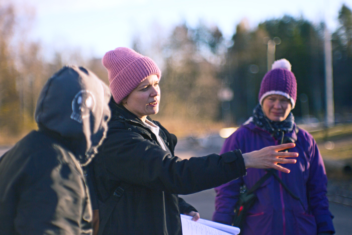
SNAPSHOTS
Director Selma Vilhunen on set. Photo: Janina Daria Witkowski
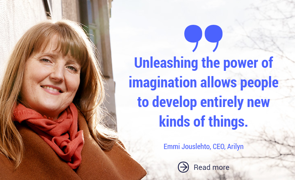
QUOTES MAY BE USED WITH THE PICTURES OF AUTHORS.
Emmi Jouslehto, Photo: Riitta Supperi

Photos may not be tinted or extracted.
EXAMPLES OF USING PHOTOS IN LAYOUTS

Brand images
If high-quality portraits, images of works, or situational photographs are not available, you may use Kopiosto’s own brand photography. Brand images are suitable for all communications produced by Kopiosto and AVEK, including websites, newsletters and social media. They may also be used to add visual interest to presentations.
Choose a brand image that fits the topic. You may crop the image to suit your purpose and, if necessary, add text or a logo on top of it. However, do not otherwise edit the image, such as by adjusting the colour tone or exposure.
The rights to the brand photographs are owned by Kopiosto, so there is no need to credit the photographer when using them.
Brand images are stored in the organisation’s internal folders.
Other images
In some cases, images need to be sourced elsewhere. When doing so, consider how well the image fits AVEK’s overall visual identity. Keep the following in mind:
- We do not use AI-generated images.
- We use colour images only – no black-and-white images, heavily processed images, cut-outs, etc.
- A positive feel, but not an artificial “stock photo” look (e.g. people in suits in an office giving exaggerated high-fives).
- Prefer natural light (avoid harsh fluorescent lighting).
- No collages created using cut-out images, and no computer-generated imagery. Avoid illustrative styles that are not aligned with AVEK’s visual identity.
- Aim for a colour palette that works with AVEK’s brand colours. However, images must not be colour-tinted.
- Photographs may be combined with AVEK’s own line graphics or other infographic elements that fit the visual style, provided they use AVEK’s colours.
If a stock image is used, Kopiosto’s legal counsel must review and approve the licence terms. Please note that stock images are often subject to a so-called stand-alone rule, meaning the image must not be published as-is (e.g. on a website where it could be easily copied for reuse). Therefore, stock images should include added elements such as text or an AVEK visual identity element.
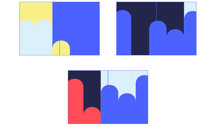
6. PATTERN
Our pattern, based on the brand elements, can be used when it’s not possible or purposeful to use, for example, a good-quality photograph.
The pattern is cropped tightly so that the pattern is big, and a maximum of 3−4 “bars” can be seen.

EXAMPLES OF CROPPING THE PATTERN
7. FILE TEMPLATES
AVEK staff can use the templates via MS Word and Powerpoint.
POWERPOINT TEMPLATE

WORD TEMPLATES
8. EXAMPLES OF OTHER APPLICATIONS
BUSINESS CARD
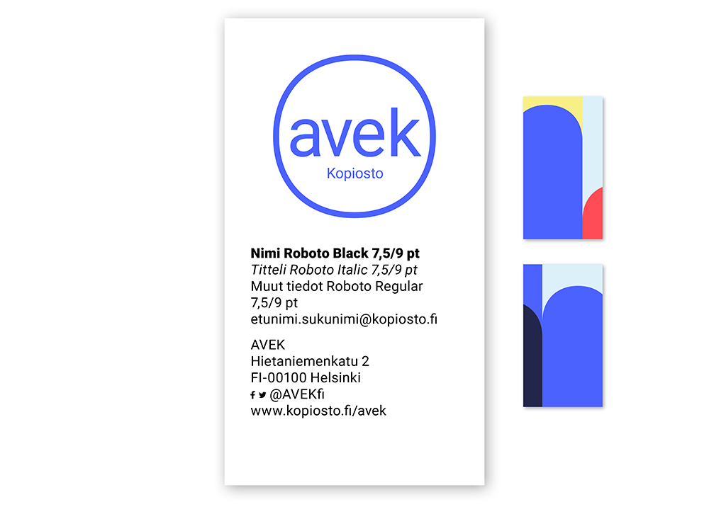
Size: 50 mm x 90 mm (vertical)
ROLLUP
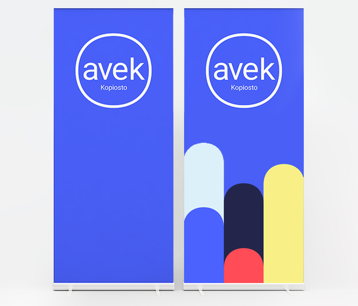
Size: 850 mm x 2200 mm
For additional information or assistance, please contact Kopiosto’s communications: viestinta (at) kopiosto.fi.